

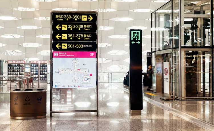
Metal signage communicates a company’s identity through material, structure, lettering, and finish. For commercial buildings, offices, retail locations, and corporate facilities, these details influence how clearly a sign presents a brand and how well it fits its surroundings. A well-planned sheet metal sign requires more than selecting a metal panel; proportions, edge treatment, surface consistency, mounting methods, and lighting must work together. By evaluating these elements early, businesses can develop signs that look professional without relying on unnecessary decoration.
Balanced Proportions and Thoughtful Layout
Proportion is one of the first details that determines whether a metal sign looks organized. The relationship between the sign’s overall dimensions, logo, lettering, and surrounding empty space affects how viewers interpret the information. When these elements compete for attention, even carefully manufactured signage can appear crowded.
Designers should establish a clear visual hierarchy before production. Company names and primary identifiers generally need more prominence than secondary messages, while supporting information should remain readable at the intended viewing distance. Consistent alignment and controlled spacing help different elements form a unified composition.
For business signs installed at entrances or reception areas, the layout should also reflect the available wall space and viewing angle. A design intended for a large exterior façade may require different proportions from one positioned beside an office doorway. Matching the layout to its environment creates a more deliberate appearance.
Surface Finish That Supports Brand Identity
The surface finish determines how metal interacts with ambient light and how its color relates to nearby architectural materials. Brushed, polished, matte, and coated surfaces produce different visual effects. The appropriate choice depends on the company’s brand guidelines, installation environment, and desired maintenance requirements.
A brushed finish can introduce subtle linear texture, whereas a polished surface creates stronger reflections. Matte finishes generally reduce glare, which may help maintain visual clarity in brightly lit locations. Coated finishes can support a specified color scheme, provided the coating is suitable for the intended application.
When selecting a sheet metal sign, businesses should consider the complete installation rather than assessing a finish in isolation. Wall color, nearby glass, lighting direction, and exposure to weather can all affect the final result. Requesting finish samples and reviewing them under representative lighting helps reduce discrepancies between design expectations and the installed sign.
Clean Edges and Consistent Lettering
Edge quality is a practical detail with a direct visual effect. Uneven borders, rough cut edges, visible burrs, and inconsistent corners can make a metal sign appear unfinished. Accurate fabrication and suitable edge treatment help create a cleaner outline, particularly when the sign is viewed at close range.
Lettering deserves the same attention. Typeface selection, character spacing, stroke thickness, and alignment should be considered together. A highly decorative font may not suit a business that needs immediate recognition, while excessively thin characters can become difficult to read from a distance or under changing light conditions.
Fabrication methods should follow the design’s requirements and the selected material. Cutting, bending, welding, and finishing processes may each affect the final appearance. Where a design includes folded returns, layered elements, or separate metal letters, consistent dimensions and careful assembly help preserve visual continuity across the complete sign.
Mounting Details and Visual Depth
The way a sign attaches to a wall influences both its stability and its appearance. Exposed fasteners may suit an industrial aesthetic, while concealed mounting can create a cleaner presentation when the installation conditions allow it. Neither approach is universally preferable; the decision should account for the sign’s weight, substrate, location, and access requirements.
Stand-off mounting can introduce a gap between the sign and the wall, producing natural shadows and a sense of depth. Flush mounting creates a closer relationship with the supporting surface and may be appropriate where a restrained appearance is preferred. Both methods require compatible fixing arrangements and suitable structural support.
For business signs used outdoors, designers and fabricators should also consider wind exposure, moisture, corrosion risks, and the condition of the mounting surface. Planning these factors alongside the visual design helps prevent installation hardware from becoming an afterthought. The result should look intentional while remaining appropriate for its operating environment.
Lighting, Contrast, and the Final Inspection
Lighting should clarify the sign rather than distract from its content. Exterior illumination, nearby architectural lighting, or integrated lighting can change the way metal colors and textures appear. Reflective finishes may produce glare under direct light, while insufficient contrast can reduce legibility in shaded or nighttime conditions.
Designers should evaluate the contrast between the lettering, sign background, and surrounding architecture. They should also consider the viewing distance, expected ambient light, and whether the sign needs to remain legible from multiple directions. Where illumination is included, its placement and intensity should complement the sign’s dimensions and visual hierarchy.
Before installation, the finished sign should be checked for consistent color, surface defects, clean edges, aligned lettering, secure assembly, and conformity with approved drawings. Lighting and mounting should also be reviewed where applicable. This inspection provides an opportunity to identify production inconsistencies before the sign becomes part of a permanent commercial environment.
Creating a Consistent Standard for Metal Signage
Refined metal signage results from coordinated decisions rather than a single decorative feature. Proportion establishes order, surface finish defines material character, precise edges improve presentation, mounting creates depth, and appropriate lighting supports readability. Each detail should serve the same objective: presenting the company’s identity clearly within its architectural setting.
COSUN SIGN offers sheet metal structure signage solutions through its dedicated product category. For businesses planning new signage, they recommend evaluating design requirements, fabrication details, installation conditions, and finish expectations together. By coordinating these considerations from the outset, the manufacturer helps customers explore metal signage options suited to their project requirements and brand presentation goals.
